YA is a pizza pop-up restaurant serving plant-based sicilian-style pizzas in Portland, Oregon.
︎︎︎
Branding + Art Direction
for YA Pizza
2018
︎︎︎
Branding + Art Direction
for YA Pizza
2018
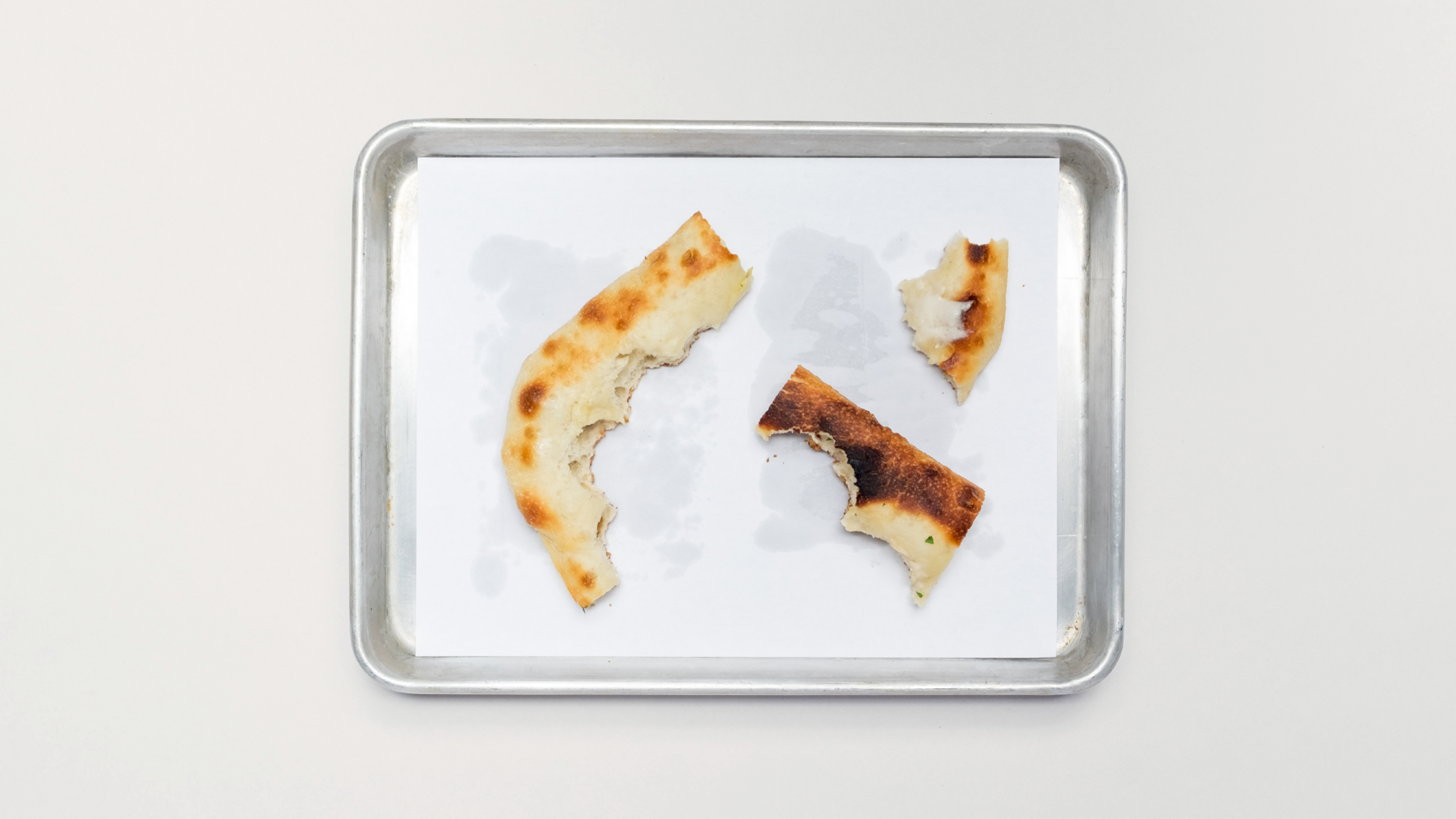
YA is branding for a side-passion of mine—combining both my design and pizzamaking into a thing of its own.
It was sparked with the intent to just have a good Sicilian slice that evolved into an obsession over crafting the (in my opinion) “perfect” pizza.
It was sparked with the intent to just have a good Sicilian slice that evolved into an obsession over crafting the (in my opinion) “perfect” pizza.
🍕️
Tasks for the creation of YA included:
︎︎︎ Logo design
︎︎︎ Packaging design
︎︎︎ Menu design
︎︎︎ Merch/promo material
︎︎︎ Photography
︎︎︎ Eating my own pizza
︎︎︎ Logo design
︎︎︎ Packaging design
︎︎︎ Menu design
︎︎︎ Merch/promo material
︎︎︎ Photography
︎︎︎ Eating my own pizza

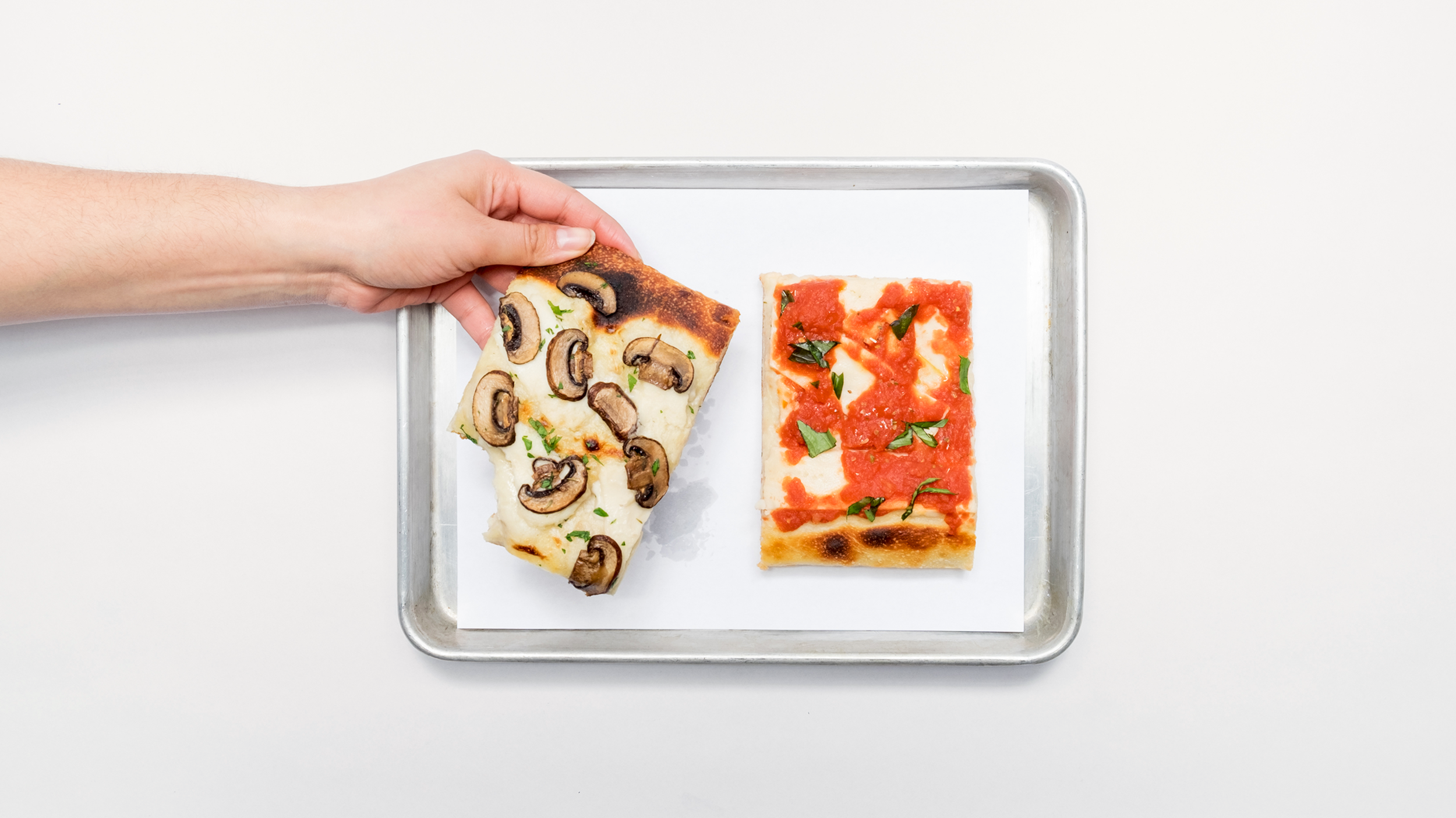
A couple of YA slices sitting alongside the printed menu.
Through the minimal and simple menu, I wanted the art direction and branding for YA to match the food itself. From leveraging the square shape that the Sicilian-style pizza lends itself to, down to highlighting the labor and love that make up the pizza (naturally-leavened 72-hour dough, house-made chili oil, hand-crushed sauce, etc.)
I wanted to the brand to own exactly what it was—a quality slice made distinct by its style, ingredients, and time put into it to be at the forefront to sell itself.
 Box liners, pizza toppers, and chili flake packets to make a pattern.
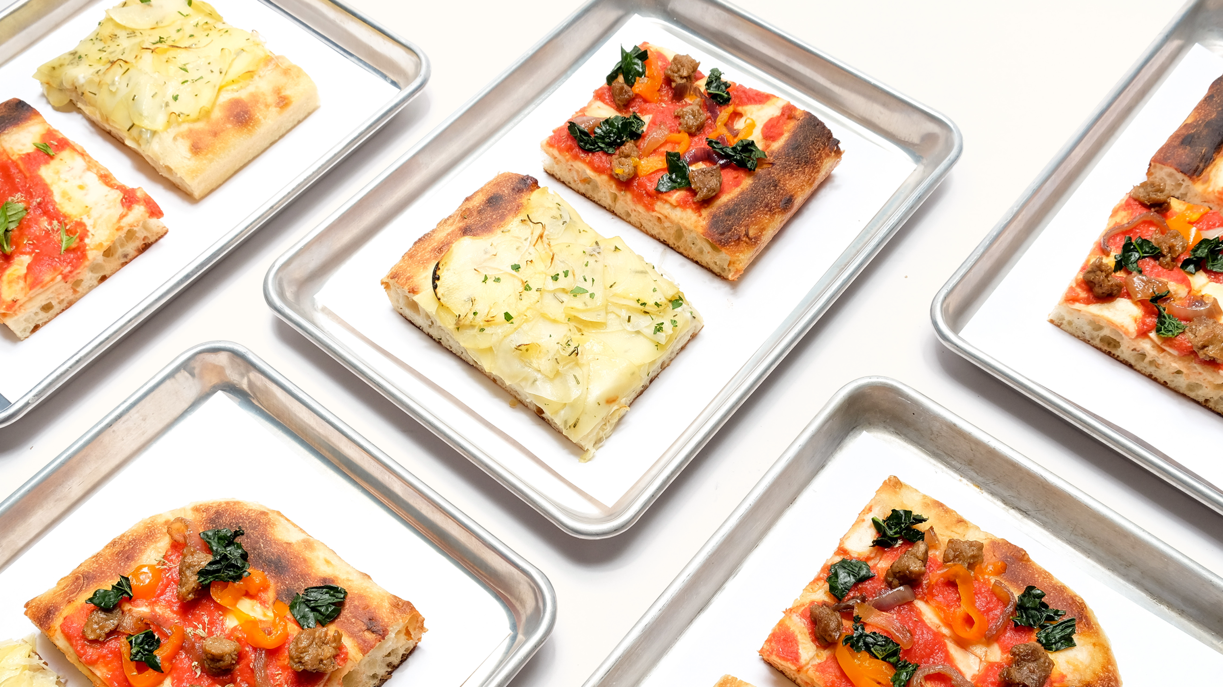
Squares on squares on squares.

YA loyalty cards blank and filled.

“The Potato” pizza—potato cream sauce, yukon gold potatoes, sliced onions, rosemary, parsley, & olive oil on a naturally leavened pizza dough.

YA tote bags with the primary and secondary marks.

YA’s Instagram profile page.